ML Talks: Detecting Methane Using Neural Networks and Security of Deep Learning
Written by WWC Team

This was a WWCode London event that was given by Rose Fenwick, Data Scientist at OMD EMEA
The greenhouse effect is caused by the sun's radiation coming towards the earth and the earth absorbing some of that energy. Some of it is reflected back into the atmosphere. The earth absorbs the majority of it and emits some heat back into space. Greenhouse gas is trapped, which keeps the planet warm. The greenhouse effect itself isn't anything to worry about. The thing that we worry about is that the amount of greenhouse gasses is increasing and so is the warming effect.
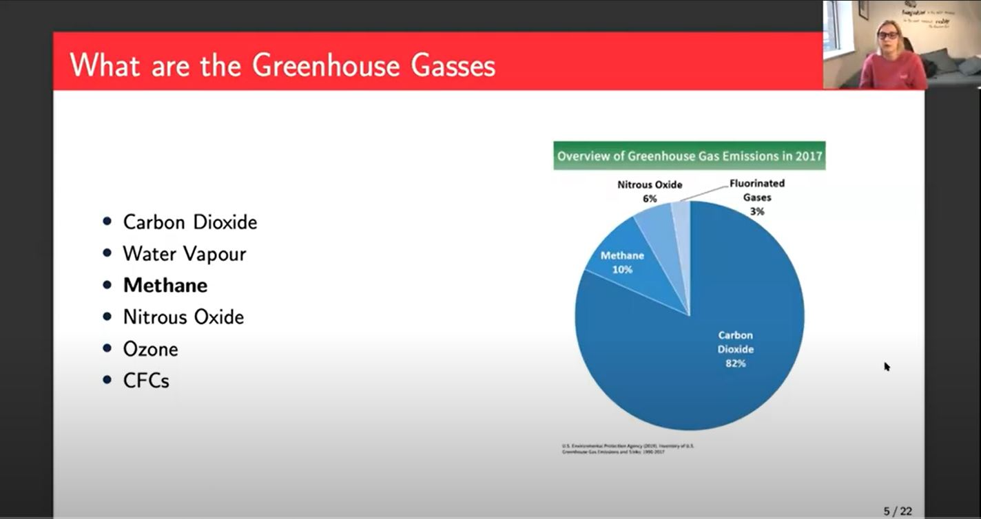
Greenhouse gasses are carbon dioxide, methane, water vapor, nitrous oxide, ozone, and CFCs. Carbon dioxide makes up most of the greenhouse gas emissions. However, methane accounts for 20% of the global warming effect, even though it's only 10% of those greenhouse gas emissions. It's far more potent than carbon dioxide. Also, 70% of methane is man-made. Most of the man-made methane comes from fossil fuel production and use and agriculture.
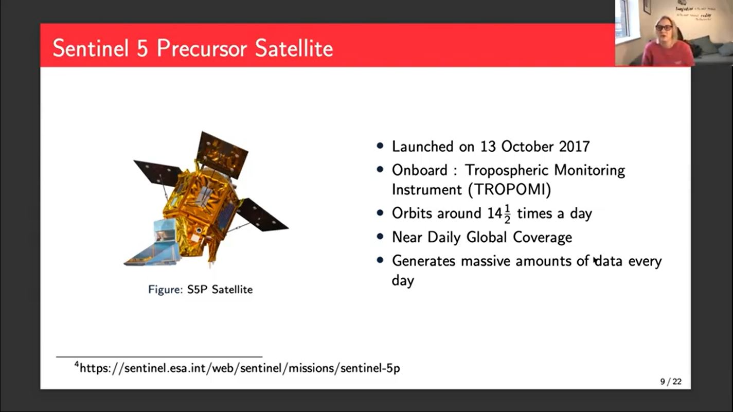
The Sentinel-5 Precursor satellite is where I got all my data. It was launched at the end of 2017. At the moment they use a forward model to get methane from this data. There are some ground monitoring systems that give us accurate methane data which they calibrate all the results from. The system is a little bit convoluted and quite slow. Sometimes it can take months to get a methane concentration from data that went in a long time ago. Anyone can take the data and calculate the methane themselves following this process, but the official product isn't often released for weeks or months after the data is downloaded.
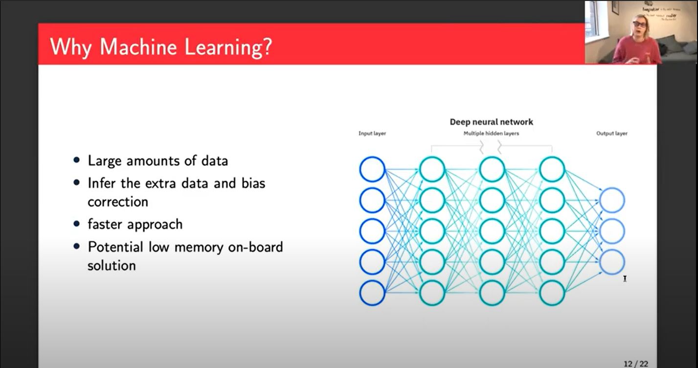
In my project, I am using a neural network solution. We have a massive amount of data. Machine learning is something that is very good at dealing with large amounts of data. We hope that by training a model using the bias-corrected data we can have the network infer the data that would've been put in. It would also do the bias correction step as part of the network because it knows that the bias-corrected data as its output. It will be much faster. If you could build a small enough network, there's a potential for a low memory onboard solution. You could put this, a Raspberry Pi or similar onto the satellite, and it could potentially get us some relatively accurate methane concentrations in near real-time.
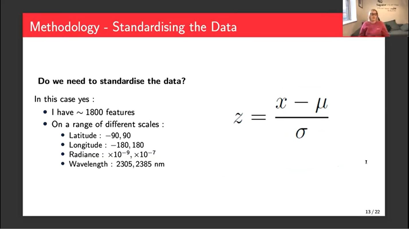
My methodology starts with standardizing the data, which is a really important step because in this case, I have approximately 1800 features, which is massive. So standardizing just brings everything to the same scale and you don't accidentally give more importance to one feature over another.
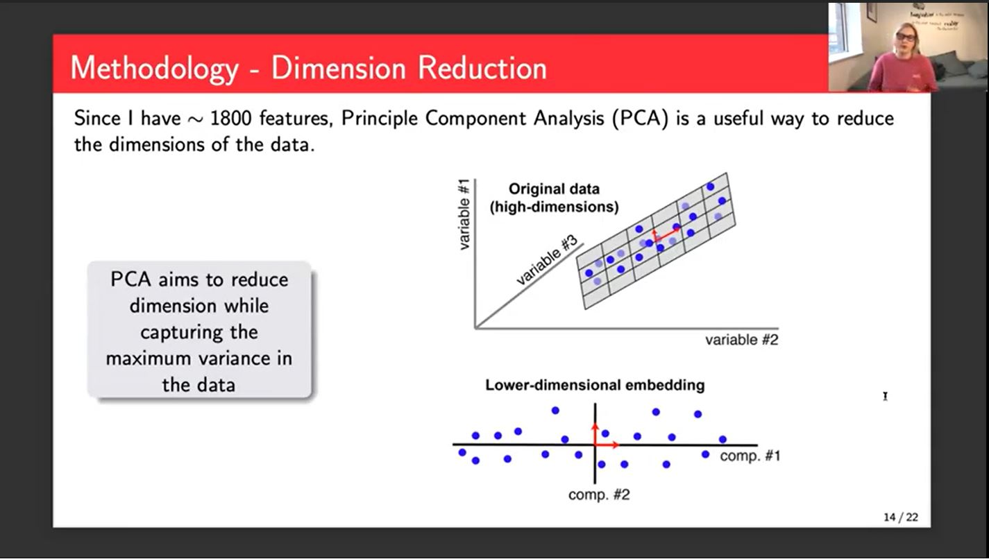
The next thing that I've implemented is a dimension reduction. We use Principal Component Analysis to reduce our dimensions. It creates 1800 new features each of which are linear combinations of the old features. In theory, a smaller number of these new features would explain the variation in the data.

The target for my network was The Hezron bias, corrected CH4 mixing ratio, which is the name of the concentration of methane in the atmosphere. Hezron is the space agency in the Netherlands. The network had two hidden layers, each with 128 and 256 nodes. I ran it over 2500 epochs, which was quite a lot. I haven't included a training curve.
One challenge I have had is there's not a lot of similar work. A lot of what I've had to do has been almost completely from scratch. There's not really a precedent for it. I did a lot of experimentation to get different hyperparameters set in the end. Also computationally massive amounts of data. I use the HPC at the university. That comes with its own challenges, queuing, queuing systems, service days, crashing at the weekend, and that kind of thing. Most of my work was done using Python. I use Keras and TensorFlow for machine learning things. I use a little bit of Jupyter Notebook and Atom for the coding itself.
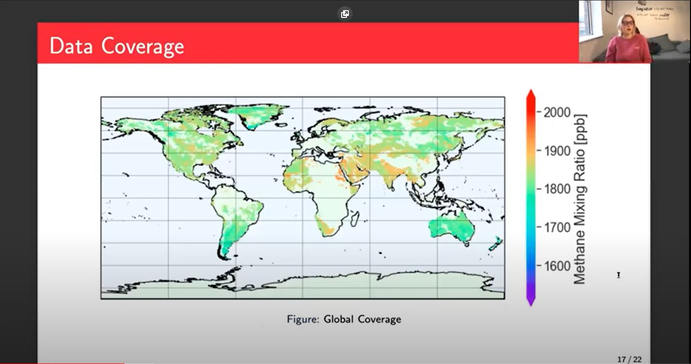
This is the coverage we get. There are some missing points. Part of that is because of the data that I had available at the time. There sections in the middle stripe that are missing that seem due to the data that I selected to train with. I'm hoping that now that I have a much larger data set covering a wider timeframe, some of those gaps will be filled in. You can see that there aren't many very low points below 1700. A lot of that gets filtered out because it's down at the bottom and not that interesting.
The interesting points tend to be the more extreme values, the darker orange, and red points because they're the extremes, they're the interesting points. That's where we might have plumes of methane or, larger emissions for various reasons. It is important that those points in particular are predicted well because that's what the focus is. If it's in the normal range, we don't really need to do that much, whereas the scientists want to know the extreme places.
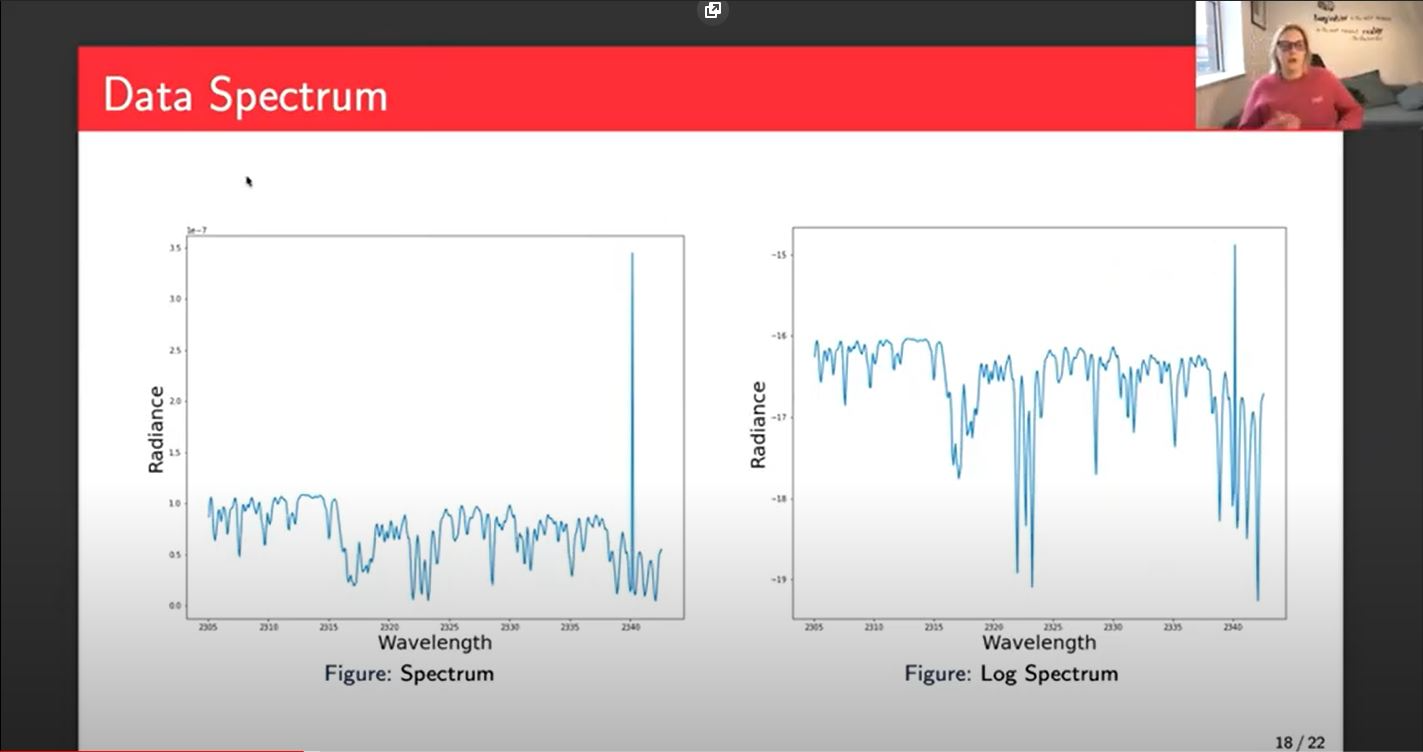
This is the spectrum and this represents the majority of my input data. I don't input it as a spectrum, but this is what it would look like plotted. On the left, we have the standard spectrum. That's almost completely raw from the satellite for one point. It's a good point. I've filtered out all the bad points so there is some filtering and a little bit of processing, but essentially that's what the satellite gives us.
The results that you see today use the left-hand side, but on the right-hand side, we'll be using the log of the spectrum, because the relationship between the radiance and methane concentration is closer to a log relationship than a linear relationship. I'll be doing some experiments to check that that is the case, but you can see that we can still see the pattern. It looks very similar left and right.
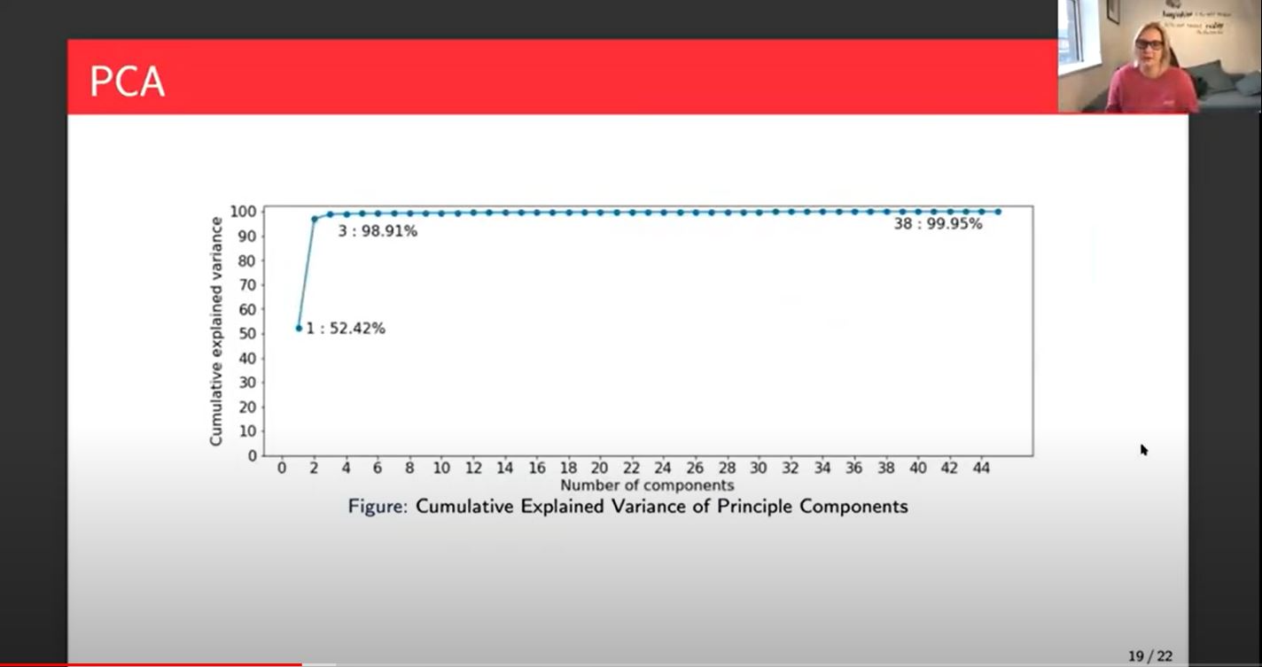
Let's talk about the PCA. We started with 1800 features. We then got our 1800 new features with the linear relationships or the linear combinations of the others. Here I've plotted 45, maybe 46 because then it just becomes a flat line of 1800 and you lose that kind of information at the beginning of this plot.
What we can see from this is that just one principal component explains the variation of the data or 52% of the variation in the data. Interestingly, that principal component is a linear combination of all of the inputs, except for a lot of the spectral data. I think only one or two spectral points were included in that. Which is interesting, because it means that you can get a lot of the variance in the data comes from that point.
The variance in the data refers to the input data and not the methane. It doesn't necessarily mean that the first principal component will be 52% accurate, just that the variation in that input data is explained or 52% of it is explained by that first principal component.
We then go up to three principal components and we get 98.91% of the variance. On most occasions, that would be enough of the variance and I'll be doing some experiments in the coming weeks and months to look at whether the difference between 3, 10, 20 and that 38, where you get to 99.95% of the variance, which is as much as you can explain with the linear combinations.
On the math side we think three will be enough, on the physics side they think we should be looking at more like 40. So that would be an interesting discussion to have when we have some more results around that.
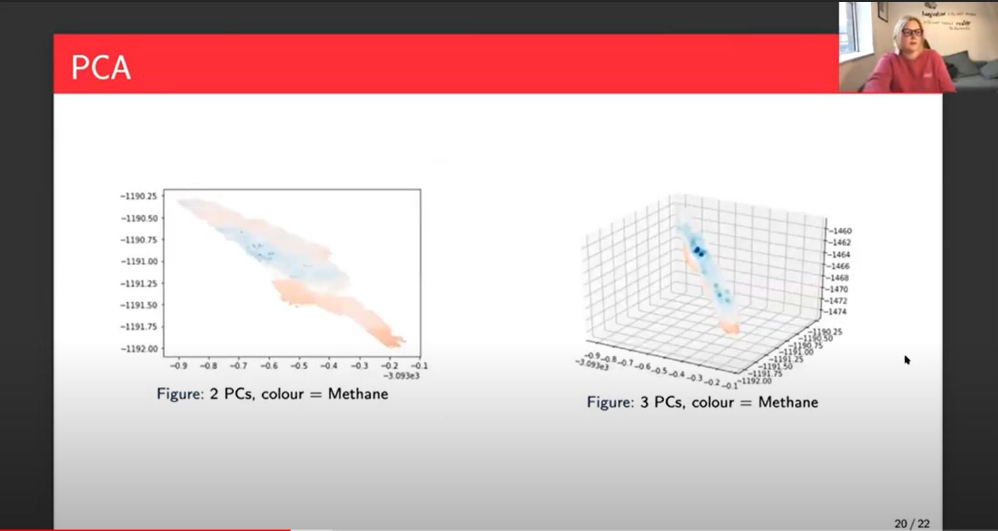
On the left, you can see just the first two principal components plotted together with the color bar being methane and so you can see the higher values of methane in the darker red and the lower values in the darker blue and the lighter blue and the lighter red or orange those middle values. On the left, you can see that there is a pattern. It's not a clear separation of the higher and the lower values, but it's not completely random, which means that there is some correlation between the two principal components.
It's not necessarily causation this doesn't say absolutely the network will be able to work it out but it's an indication that there is a correlation and therefore we might be able to see some better results. When we look over at three principal components, it's hard to say at this angle but to me it looks like we've got layers now. The darker reds on the bottom and the darker blue looks like it might be on the top. It's important to also remember that the concentration of those darker blue points and the darker red points, it's much lower than the middle points will be. You wouldn't necessarily expect a dark blue stripe or bunch.
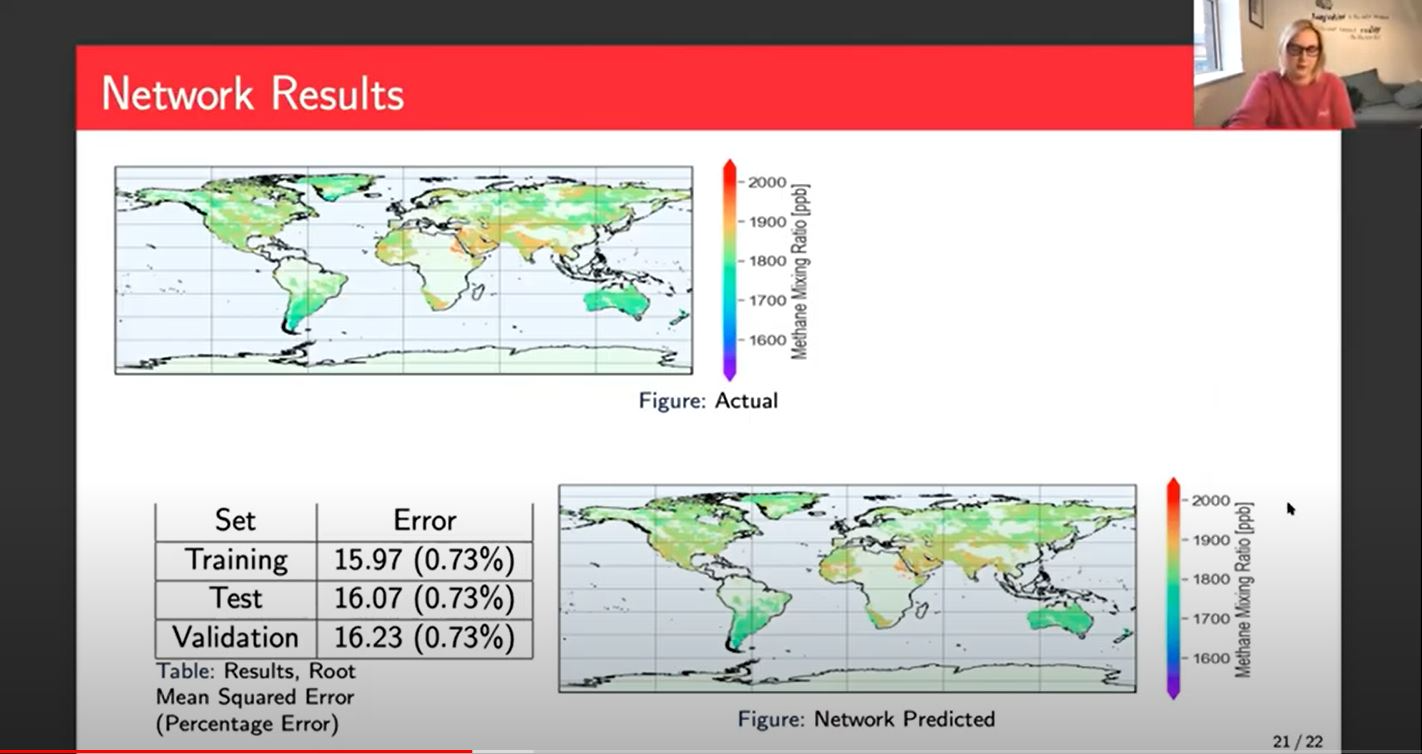
Then we have a look at the results of the actual network. On the top, kind of towards the left, we've got our actual data, the figure we saw earlier and bottom right, we can see what the network predicted. It's pretty good but when you look at it by eye there aren't many points that are different. In America, it's blurring together a bit in the predicted whereas there's some kind of cleaner, darker points in the actual area that's kind of clear all over the place. If you find the darker red points and then you look at them on the predicted area, again, they're there, but they tend to be a bit softer and not quite so prominent.
As a baseline, this is a good result. We've got our training error of 15.97 root means squared error and our validation of 16.23. All of those three sets give us a 0.73% error, which sounds really good. You think 0.73% that's tiny. But unfortunately, earth observation scientists tell me that if you have enough information and you are an expert in that area, you can, by location and time of year and a few other little bits, you can kind of guess to within about 10 to 15 parts per billion. So on that basis, 15 isn't amazing.
It's very good and in certain parts of the globe, we look at much smaller errors like 0.1%.Then in other parts, we have more like 2, 3, 4 or 5% error. So it's not quite as black and white as 0.73. There is some work to be done particularly on those extreme areas.
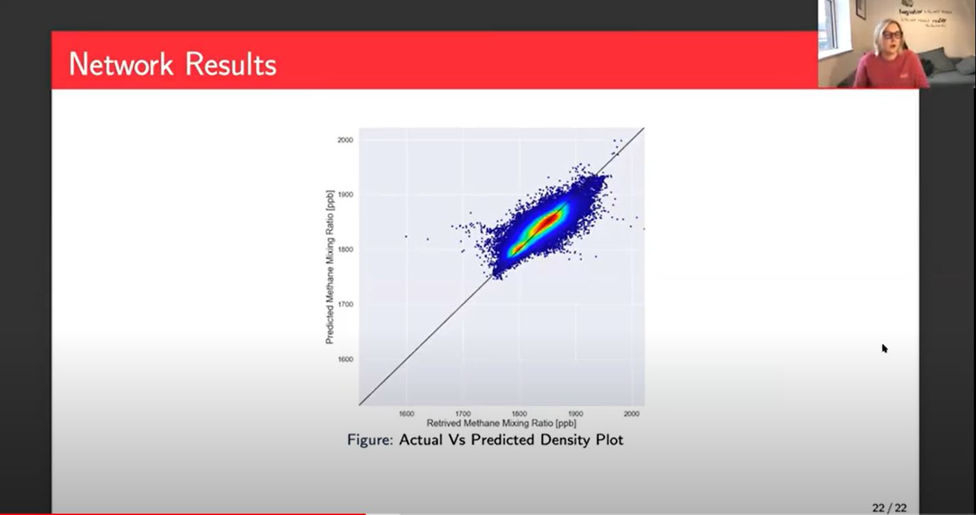
Another example of how we look at these results, this is a density plot. This shows us we've got our actual methane or retrieved methane along the bottom on the X-axis, and then our predicted on the Y-axis. Ideally you would just have a nice red line or a red line with a little bit of a blue halo along that straight line in the middle. The red shows us that there's a lot of points, a lot of data in that area and the darker blue is where you've got a bit less data. Ideally we want that nice red in the middle where most of our data is and then the blue still within that line.
My next steps will be to look at potentially a regression tree which would pull out some of these extreme points and build networks individually for those extreme points. So the majority of the data does well with this, and then some of the data be pushed off to other networks. That would involve some classification probably or K-means to get some clusters which I've loosely started working on, but don't have any strong results to share at the moment.